Sometimes, it takes a moment to notice the subtler elements of a phone’s software design – but that’s not always for the best reasons.
Take One UI 7, for example. Samsung’s latest mobile operating system update marked a major visual refresh, bringing new icons, fonts, and color schemes to the software’s visual elements.
However, as one member of the TechRadar team discovered, there’s one aspect of Samsung’s latest Android wrapper that makes less sense than ever before.
To cut to the chase, Samsung’s new battery icon is confusingly vague and hard to recognize. TechRadar’s Homes Editor Ruth Hamilton tells me that when she updated her Galaxy A54 to One UI 7, she couldn’t even tell what the battery icon was.
“I left the UI update to run overnight, and the following morning I couldn’t for the life of me work out what the icon in the top right of my phone screen was,” said Ruth.
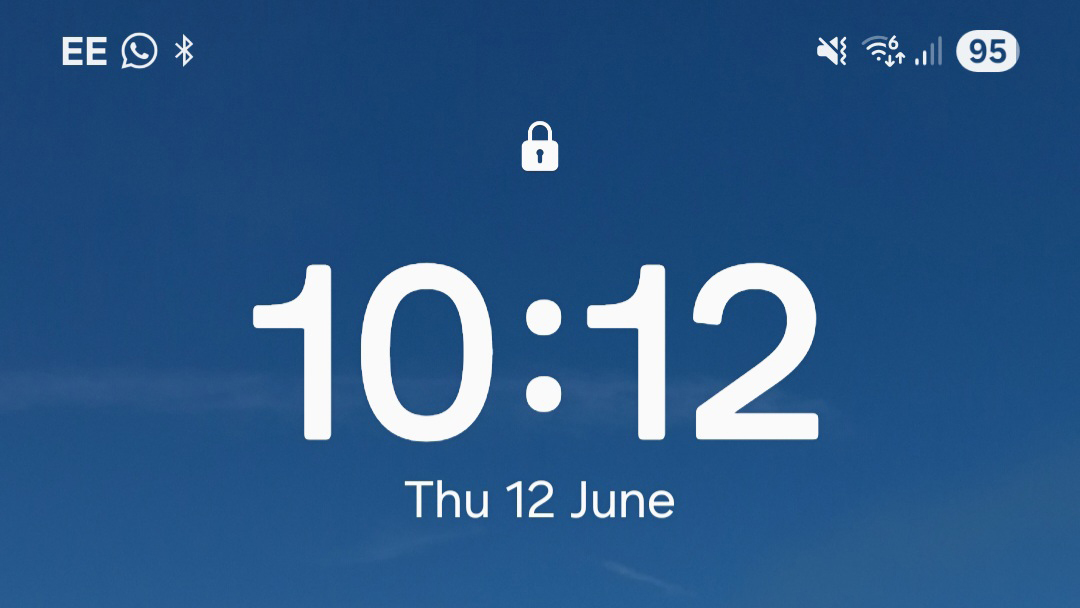
“At that point, it was half dark, half light, with a 45 in the middle. I was baffled. Did I have 45 messages? Surely not.”
Ruth added: “Amidst the general mild disorientation that follows any UI tweak for something you’re using regularly, I just didn’t twig. In the absence of the usual visual cues – a percentage symbol, or a suggestion of a terminal – I couldn’t work out what I was looking at.”
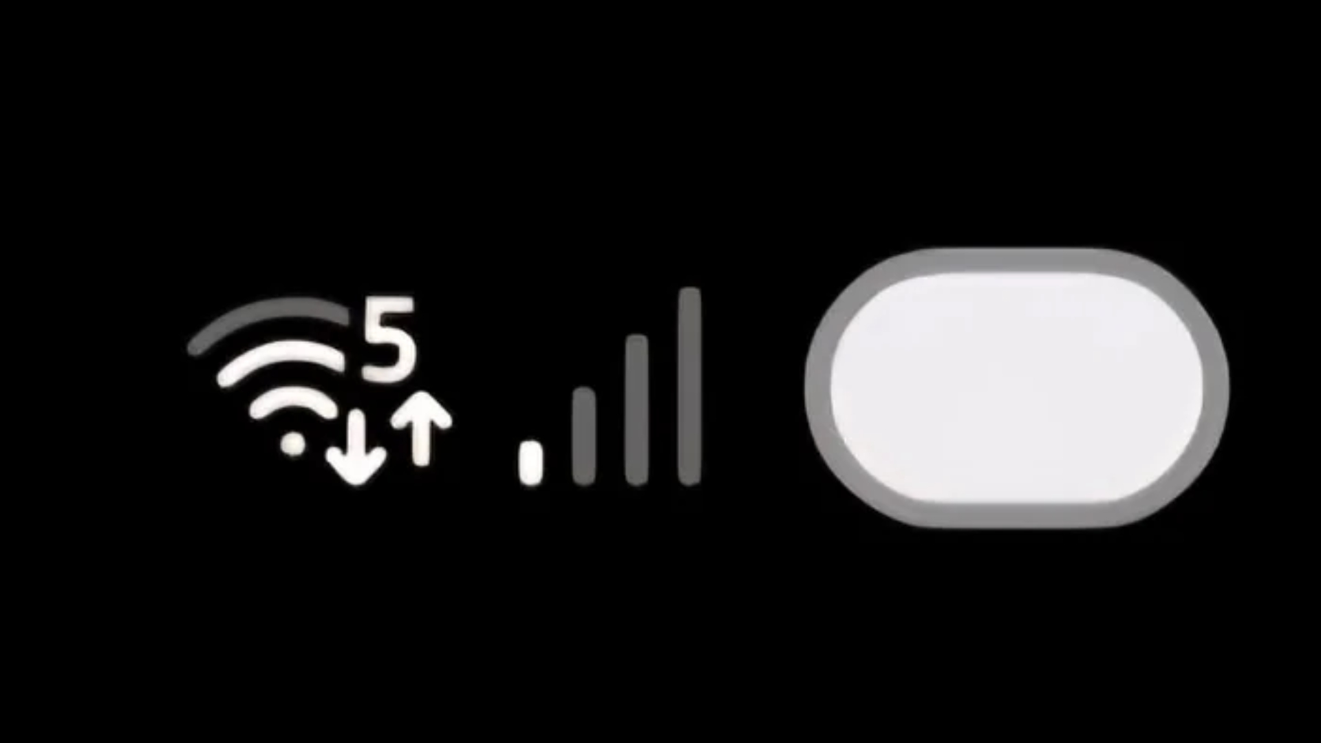
As the above details, Samsung’s new battery icon is basically just a big oval that can, optionally, have a number representing battery percentage planted in the middle. It’s more circular than rectangular and a far cry from the clear battery-shaped icon used in One UI 6.
Even as someone who tests and reviews the best smartphones for a living, I have to admit that I only really recognize the icon as a battery meter thanks to its placement at the top-right corner of the screen.
Apple got it right
As it happens, I had just finished writing a piece about Apple’s new Liquid Glass design and return to skeuomorphism (that’s digital design based on real-world things) when Ruth got in touch.
If you ask me, Samsung’s misstep with the One UI 7 battery icon shows that Apple made the right call by choosing to ramp up the realism with iOS 26, iPadOS 26, and macOS 26.
Tech moves forward in a way that can detach things from their original inspiration – take the pause icon, for example, which was inspired by the caesura, punctuation used in poetry to mark a moment of rest. I think you’d struggle to find someone on the street who could tell you that without looking it up (as I did).
But this has to be done in a way that doesn’t alienate parts of the user base. Apple sticking with the pictographic battery icon for Liquid Glass is a safe bet, but some of the best Android phones push things gently with more abstract rectangles that still feel familiar enough.
As others here at TechRadar have pointed out, Liquid Glass has its own issues with legibility, but at least everything is pretty recognizable (when you can actually see it). And, overall, I’m a big fan of the charming, colorful presentation of One UI 7 whenever I pick up one of the best Samsung phones.
With all that said, the battery icon stands as a reminder that UI design needs to cater to the everyday user as much as the smartphone specialist. Do you find Samsung’s new battery icon confusing? Let us know in the comments below.